Brand identity and digital design.
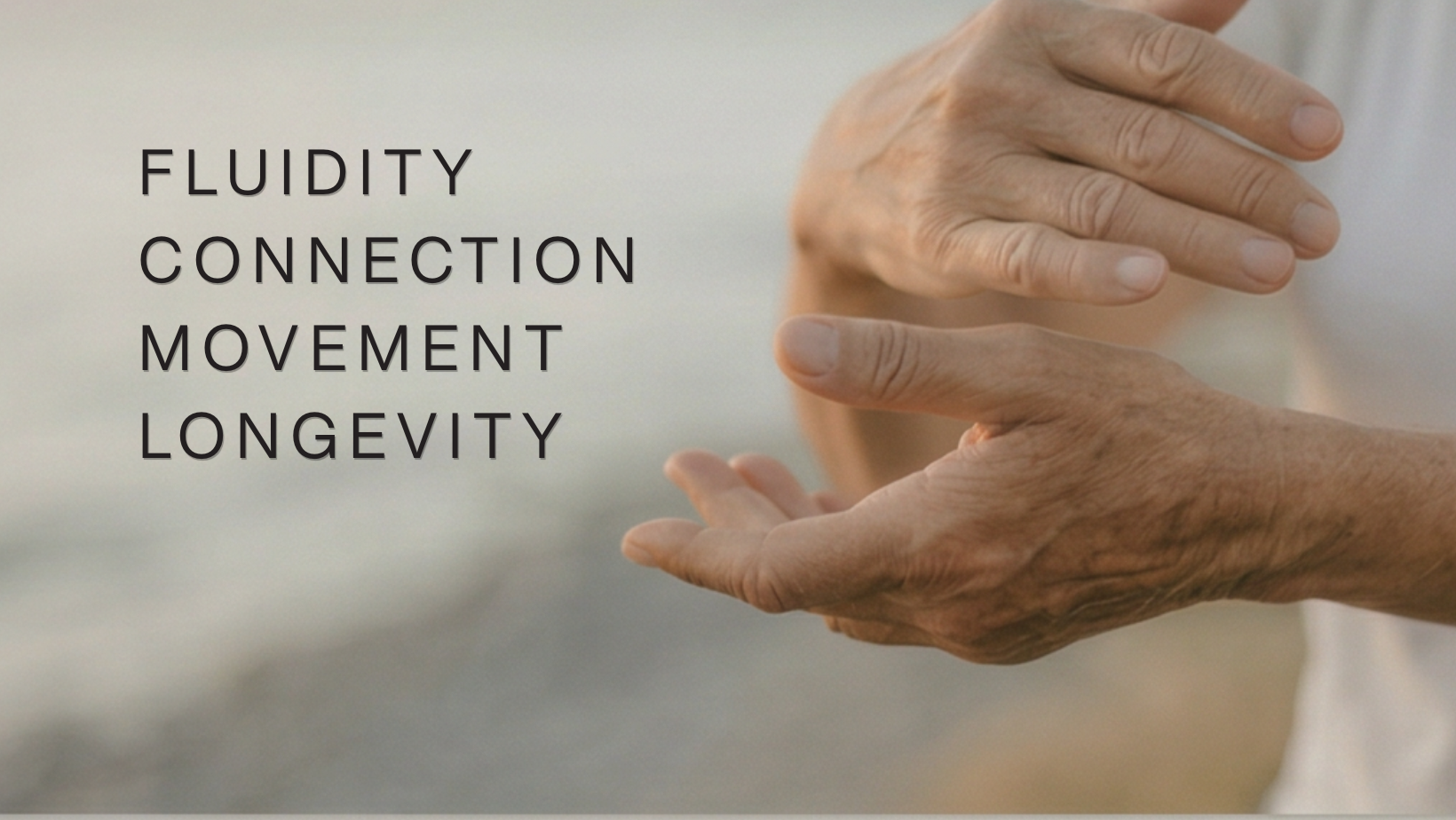
This identity was built around movement, structure, and the body itself. Rather than leaning into expected wellness visuals, the system drew inspiration from anatomy, fluidity, cushioning, layering, and subtle motion.
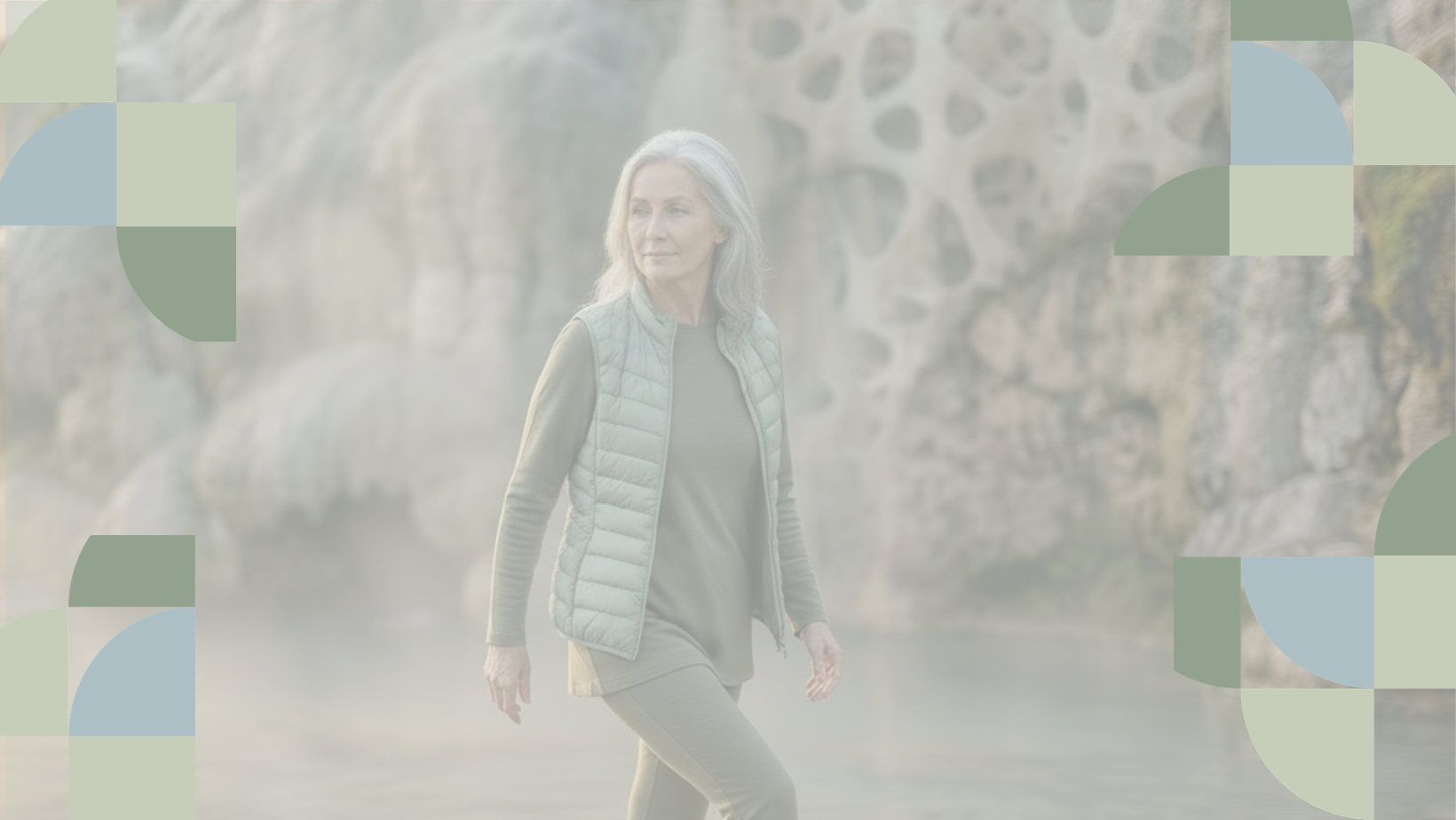
Soft gradients, bone-inspired neutrals, restrained typography, and low-contrast textures created a visual language that felt calm, modern, and informed without becoming clinical.
The result is a brand system designed to feel intentional, accessible, and quietly confident.