Fitness Studio Rebrand
Brand identity, creative direction, and campaign design.
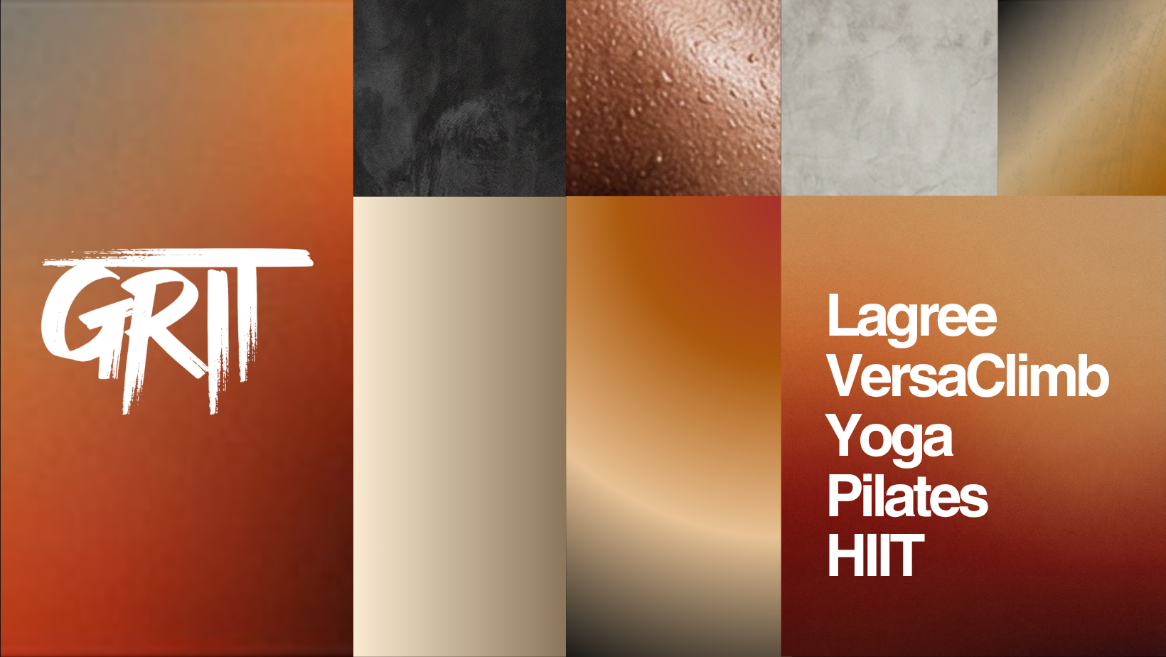
GRIT had evolved far beyond the identity it originally started with. What was once a small fitness studio had become a larger community and experience-driven brand, but the visual system no longer reflected that growth.
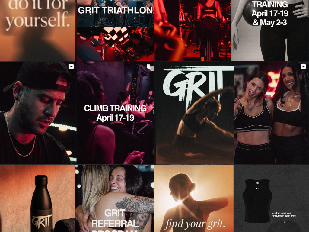
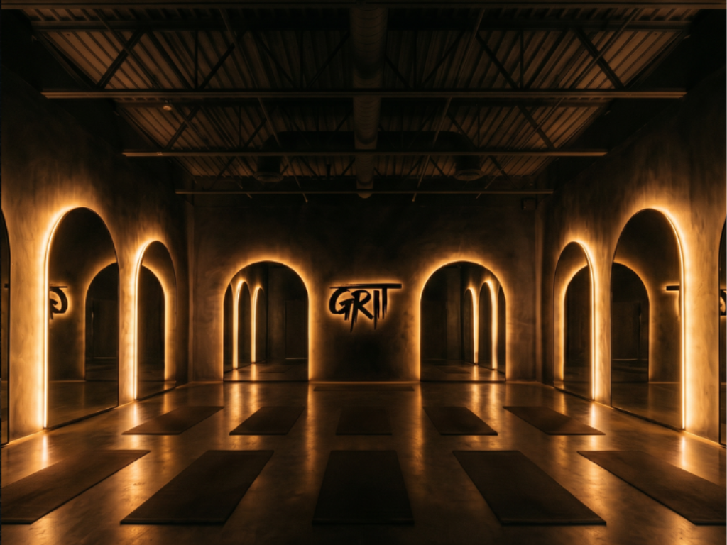
The direction focused on texture, atmosphere, and restraint rather than trend-driven wellness branding. Warm amber tones, gradients inspired by sweat and movement, tactile materials, and stronger typography created a system that felt immersive, grounded, and recognizable without losing the grit the community already connected to.
The identity extended across space concepts, merchandise, social systems, and campaign visuals.
Beautifully restrained with a pulse underneath.